Composition Tips
The goal in composition is to walk the viewer through your image in an intentional way. We want our viewers to see these moments the same way we do.
Composition is a tough topic to cover. Everyone sees things differently and how we compose a shot makes up a lot of what makes your style uniquely YOU. There are loads of articles that are going to teach you about the theory of composition and how to “correctly” frame your subjects, this is not one of those articles. I am merely going to demonstrate what I am looking for when I shoot. I have been doing this a long time so a lot of these decisions that I am making are happening automatically. The more you start searching for unique compositions the more this stuff will become second nature to you too.
The first thing I look for is light. Just as I am seeking out flattering light for my subjects, I need to be conscious of the light in my background. You will often see in my work that the area directly behind my subjects is either dramatically lighter or darker. The images below demonstrate how you can really lose your subjects to a background with a similar tonality.
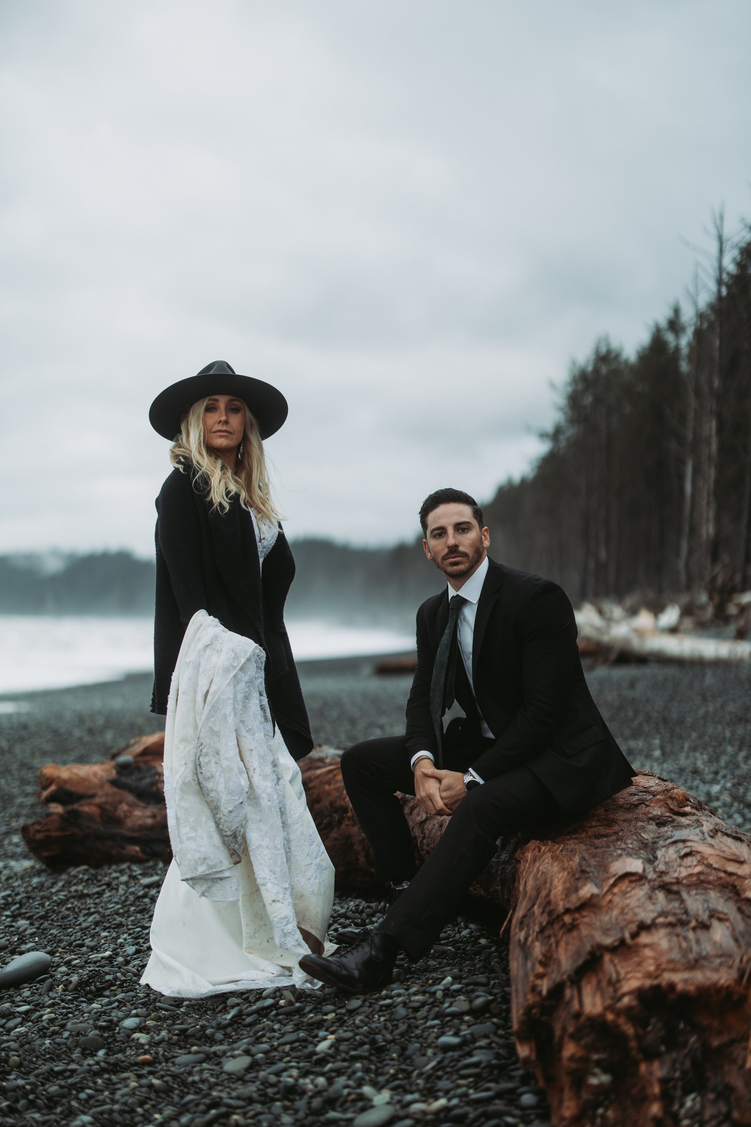
As you can see here, when I crouched to shoot more up at the subjects, I was able to put more them in the sky. This contrast does a better job of drawing your eyes to their faces.
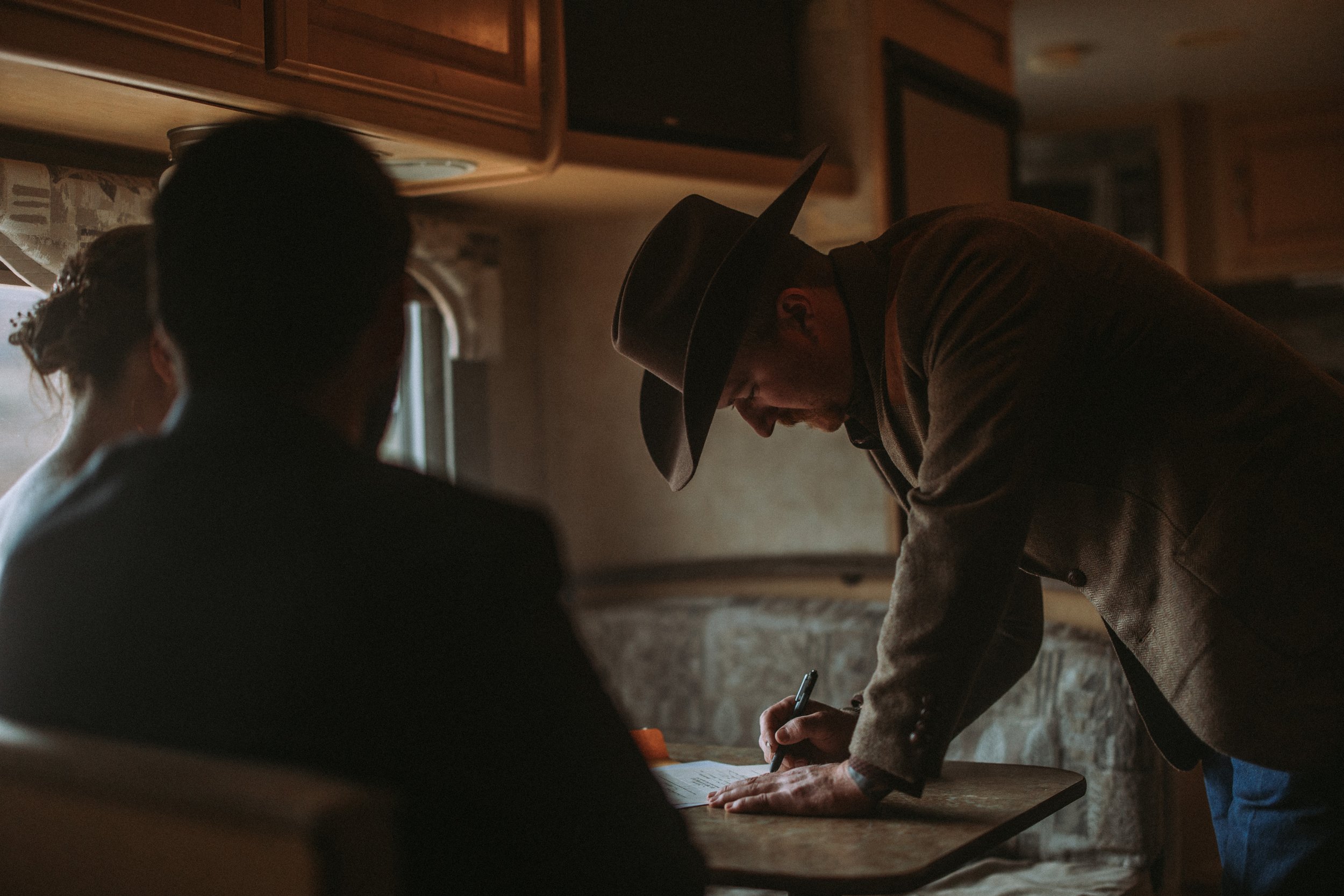
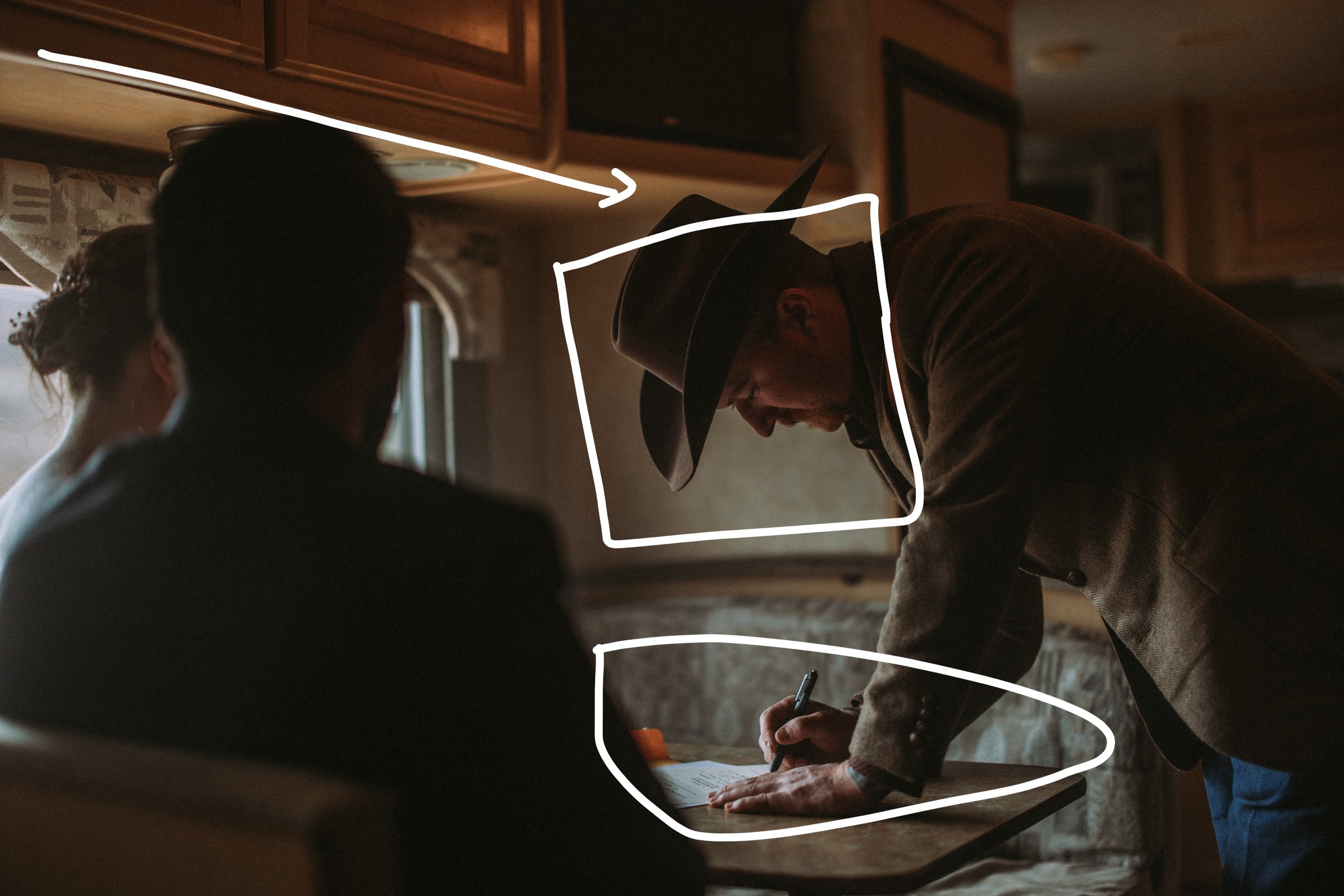
In this shot I framed the subjects head against a lighter area in this RV. If I had framed him against the darker part of the space, we would have lost him to the background. With the back of the booth being lighter, it also draws your attention his hands. There is one leading line that helps move the viewers eyes from the left where the bride and groom are, over to our subject.
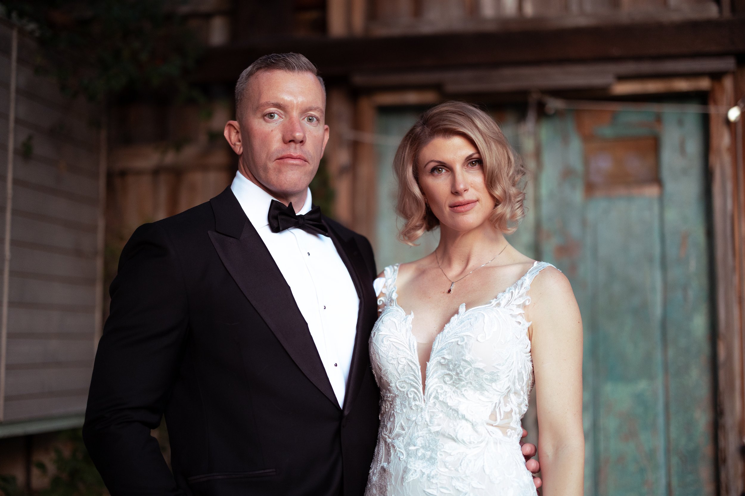
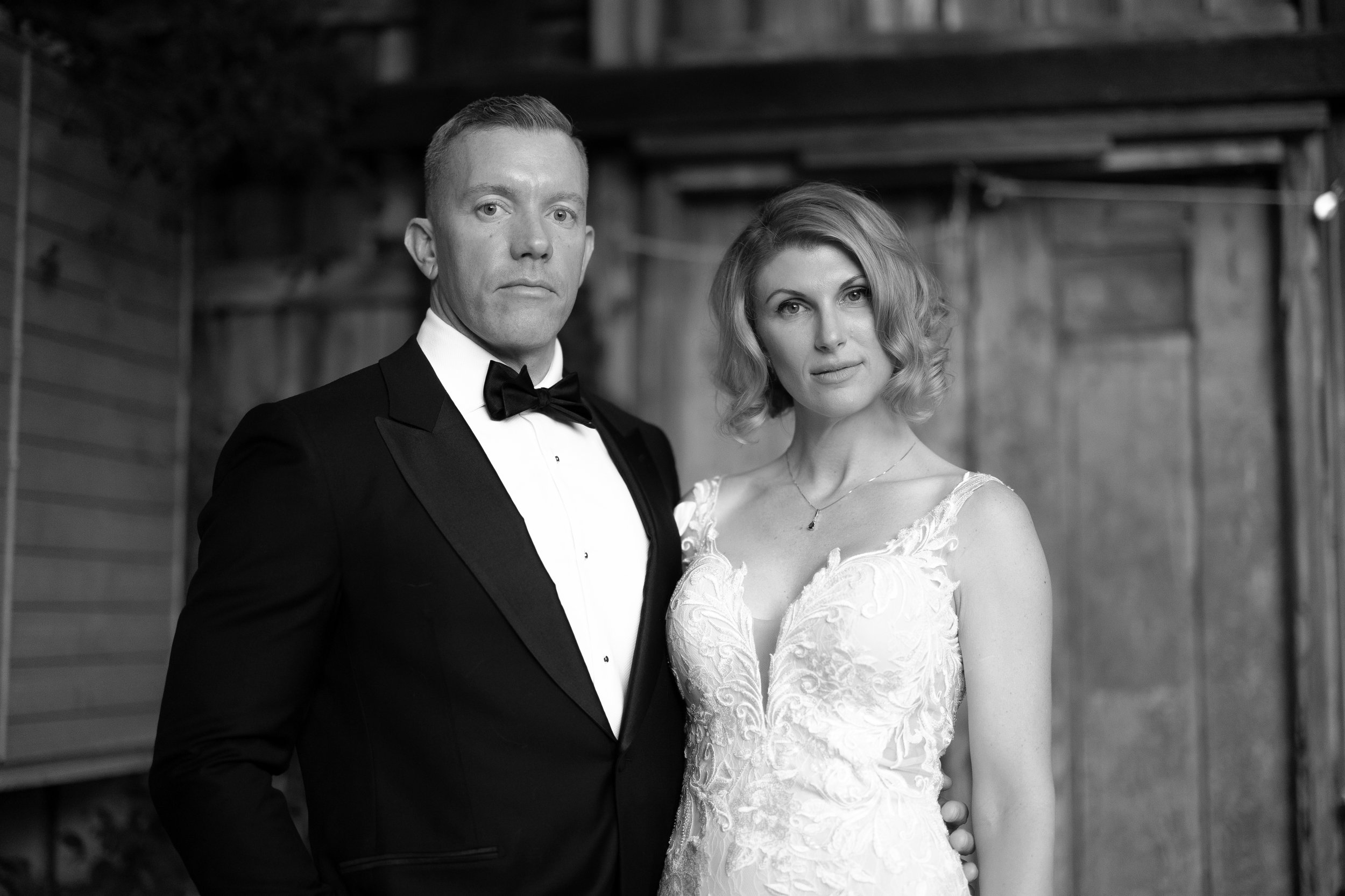
It is important to also take color into consideration. I included a monochromatic copy of this image to display how much color can impact your composition. In the monochromatic version, you can see that the background is about the same tone across the image (maybe a difference of a stop). Placing the bride against the blue area of the background draws your eyes to her.
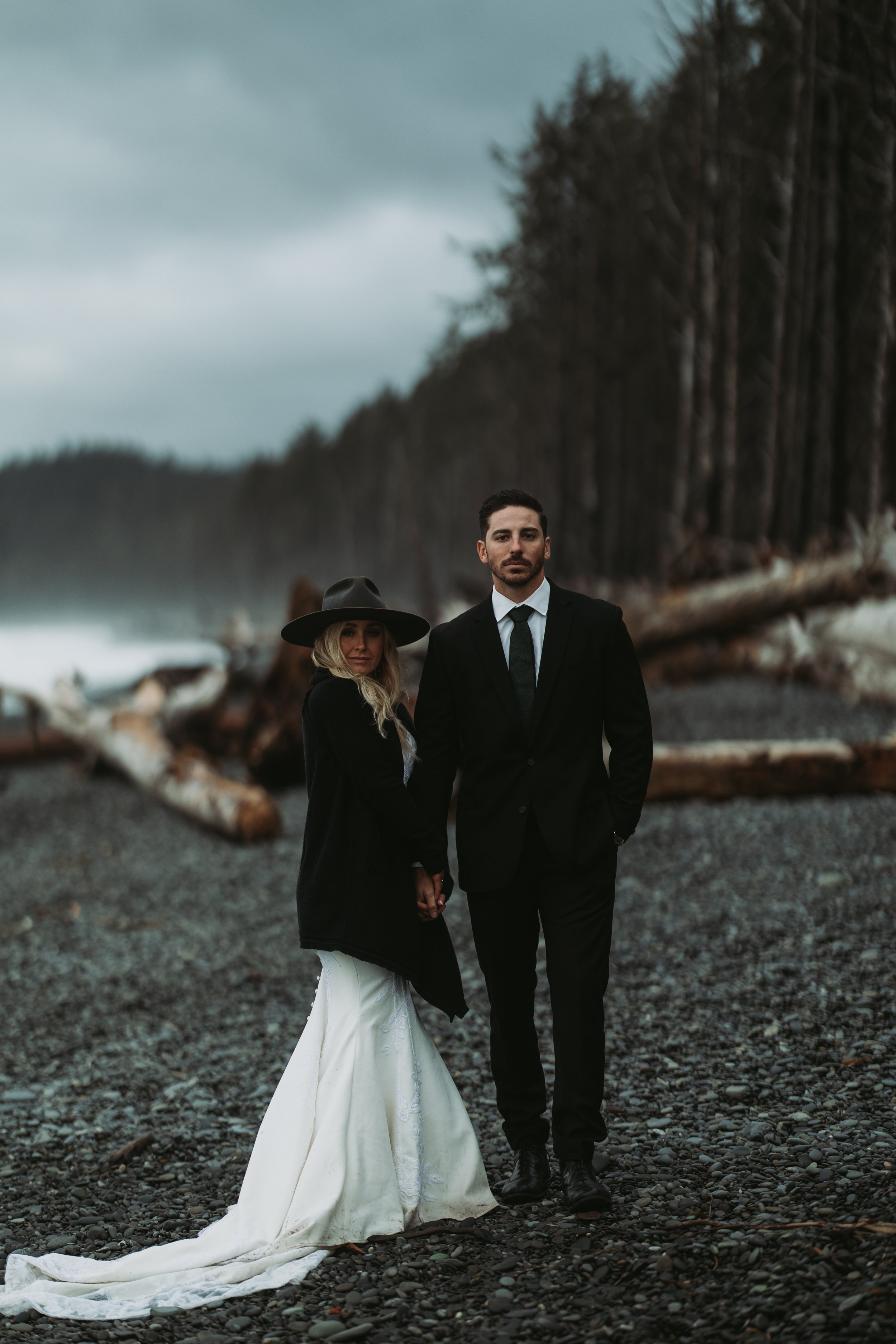
Ok, we have touched a bit on tone and color. Let’s now get into leading lines. Using the geometry in your scene to your advantage is one of the most powerful tools you have at your disposal. Oddly enough, this is what I see wedding photographers ignore the most. In the image above, I used leading lines to: emphasize the upward motion, connect their holding hands, and draw the parallel between their feet and their eyes.
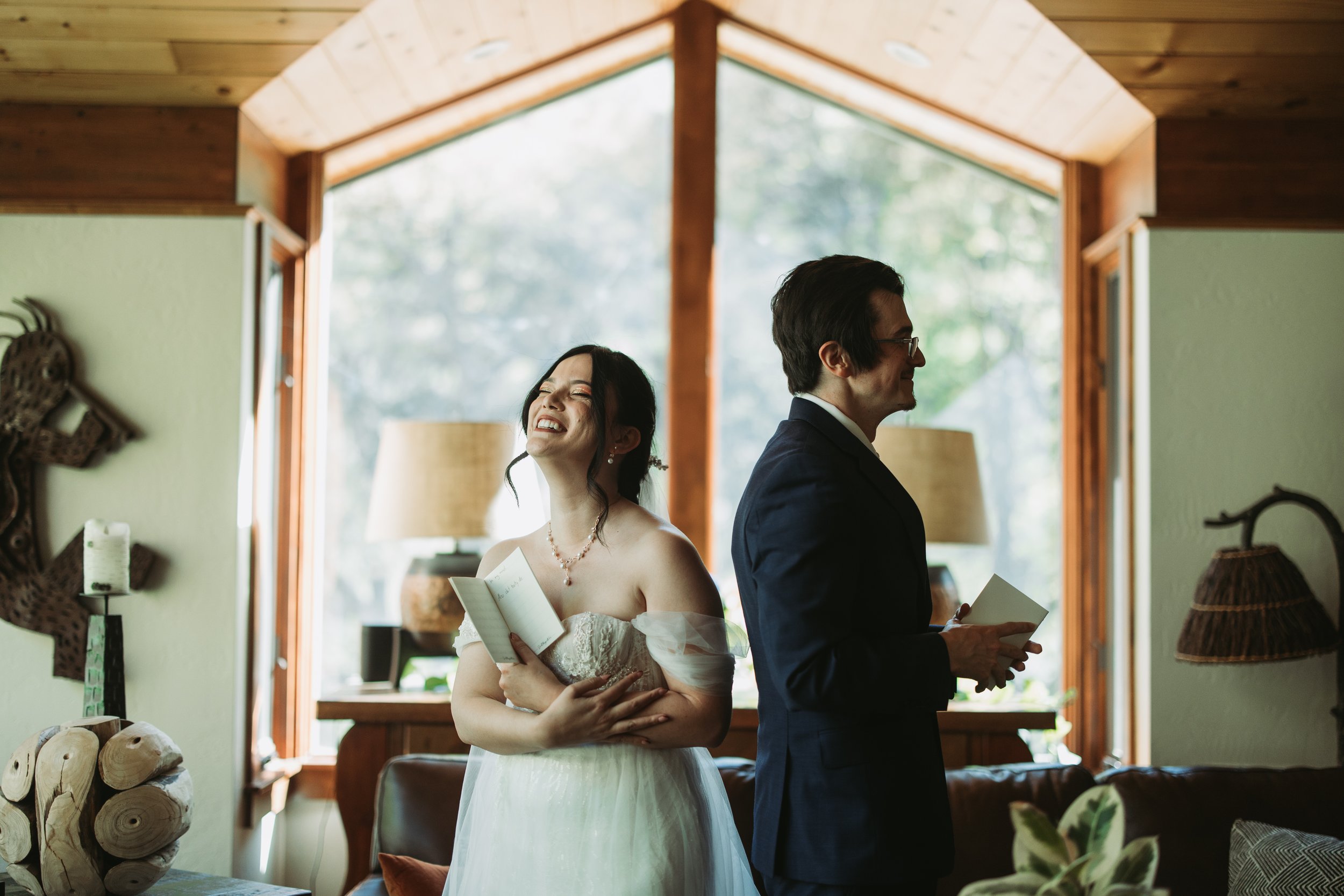
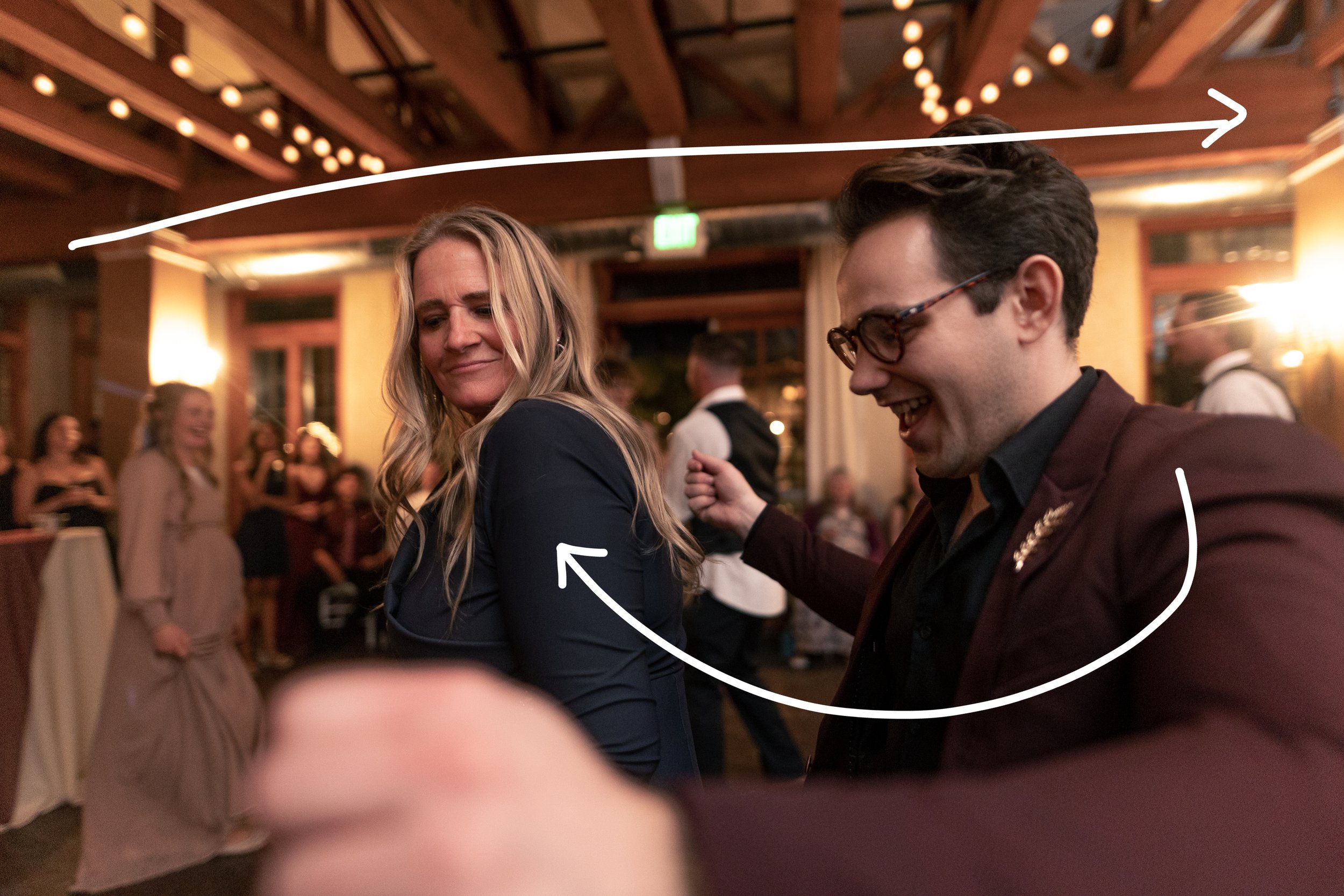
When you have parts of your subject reaching out of the frame, it puts the viewer in the action. In this image I have a long horizontal line in the ceiling framing our subject’s heads. The subjects arm is also curved pointing the viewers eyes to our other subject. Obviously I cant make all of this happen on my own. I am firing off a lot of images with a vague idea of what I am looking for. These are the types of things I am looking for when I am narrowing down my selections for clients.
Leading lines framing parallel to the subject’s body language.
It really is as simple as finding lines that point to your subject(s)
When you are working with moving subjects, try making your composition with the background in mind first. Here I was really intrigued by the DJ’s lights so I moved until my subjects were framed against that area in the background.
Improving your eye for composition is a life long pursuit. I encourage you to constantly seek new ways of framing your subjects against the backgrounds. Find new ways of seeing light, color, and geometry.


